User Psychology in Digital Design: The Hidden Force That Makes Your App Irresistible (or Instantly Deleted)
Hi everyone,
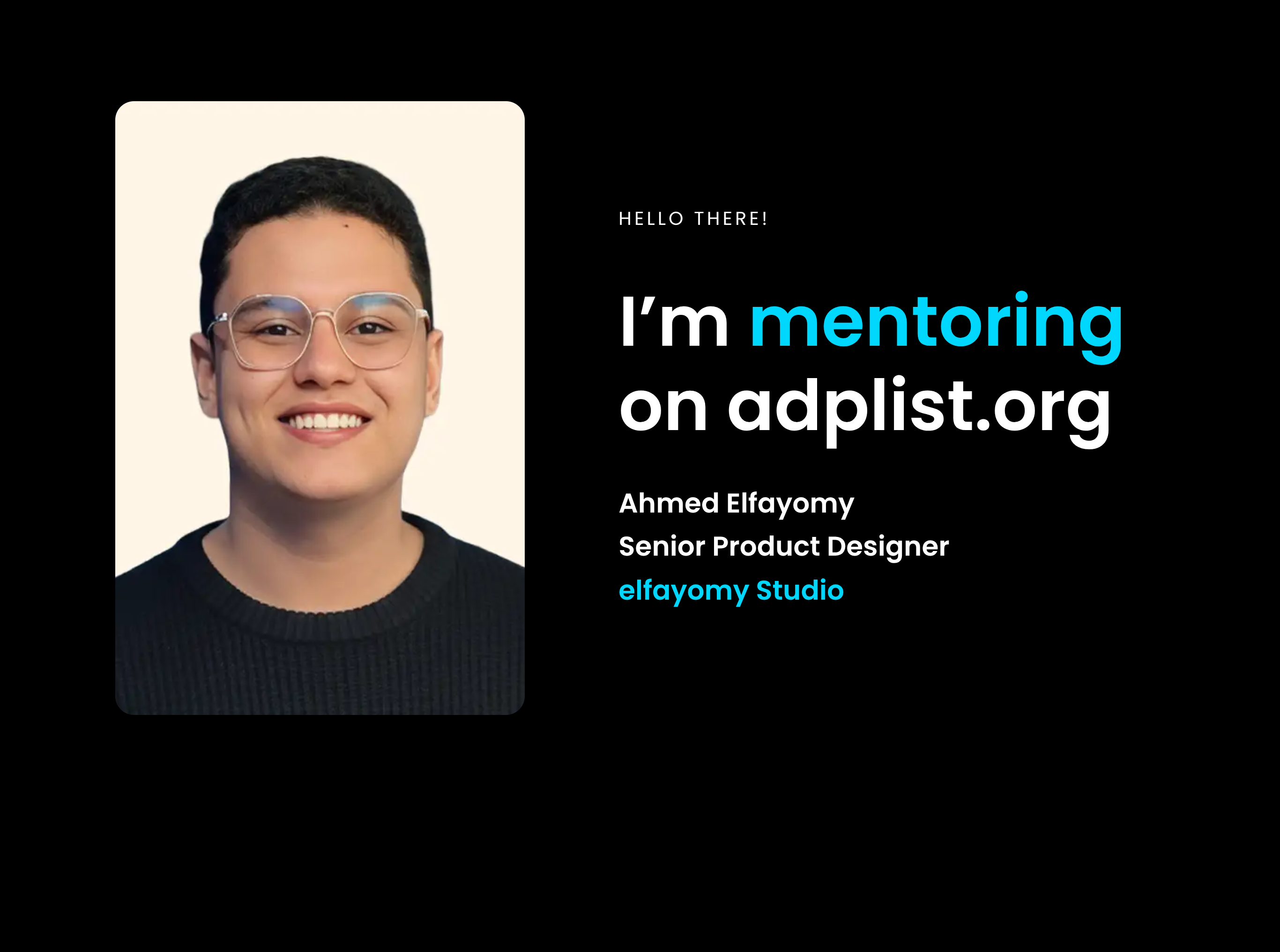
I’m Ahmed El-Fayoumi, a freelance UI/UX designer from Egypt For over five years, I’ve been working with clients across Saudi Arabia and the UAE Today, I want to talk to you about something I genuinely believe is the real secret behind any successful app or website: user psychology.
Let me start with a truth that might sound a bit surprising:
When a user deletes your app, it doesn’t mean they hate it.
It simply means they don’t feel comfortable using it.
You may have worked hard on the idea, invested heavily in development, chosen attractive colors, and packed the app with features. Yet the user opens the app, scrolls for a moment and then silently deletes it.
What happened is usually not caused by a bug.
Not by slow server performance.
And not even because a competitor is better.
The real reason is often much deeper than that.
It’s usually a small psychological mistake in the user experience something the user’s brain felt before they could consciously explain it.
The user deleted the app.
In UX design, decisions are rarely as rational as we like to think.
Users don’t sit down to analyze every detail they feel.
They feel safety or tension, simplicity or complexity, trust or doubt.
And within seconds, their brain makes a decision: Do I stay, or do I leave?
In this article, I won’t talk about complex theories or unnecessary academic terms.
Instead, I’ll share real psychological UX mistakes I’ve personally seen in apps and websites and how these mistakes quietly destroy the user experience without the app owner even realizing it.
Whether you own an app, design for clients, or are considering entering the UX field, this article may completely change how you think about why users leave and when they decide to stay.
Why do people fall in love with one app and ghost another?
The answer is not hidden in code or server speed.
It’s hidden inside the user’s mind.
When I design an app, I’m not just drawing interfaces.
I’m trying to answer questions like:
- What makes someone feel calm and in control?
- What triggers frustration and makes them quit?
- What makes them feel smart and rewarded?
- And most importantly، what makes them come back tomorrow… and the day after?
That’s user psychology، and it’s the real reason why some apps become daily habits while others are forgotten.
Real examples from my work and the market
1. Dopamine & Micro-Rewards
When a user sees “Item added to cart successfully” with a green flash and a subtle sound, their brain releases a small hit of dopamine. That tiny feeling of achievement keeps them going.
I used this exact technique in a Saudi e-commerce project completion rate increased by 34% just by adding thoughtful micro-rewards.
2. Hick’s Law Too Many Choices Kill Conversion
If you give a user 12 payment options, they freeze and abandon When we reduced it to the 4 most popular in KSA & UAE, abandonment dropped dramatically.
Fewer choices = faster decisions = higher sales.
3. Blue = Trust
Banks and wallets use blue because it subconsciously signals safety and reliability In an Emirates-based fintech project, I applied deep blue tones with lock icons and trust badges on every payment screen clients reported feeling noticeably more secure.
4. Social Proof at the Perfect Moment
When a user is hesitating in the cart, showing “3,200+ people bought this item this month” dramatically increases conversion. This is classic Social Proof psychology, and I use it in almost every e-commerce redesign I do.
What happens when you ignore user psychology?
- High bounce & churn rates
- Bad reviews in app stores
- Extremely expensive customer acquisition
- An app that looks amazing in screenshots but no one actually uses
I’ve seen it happen many times with clients who tried to build themselves or worked with designers who focused only on visuals When they finally came to me, they said: “We thought it was a coding issue turns out it was an experience issue.”
Want to learn how to apply this in your own projects?
Right now I’m preparing my first full Arabic training course (with English subtitles coming soon):
“User Psychology from Zero to Mastery – How to Design Apps & Websites People Love & Keep Coming Back To”
The course will cover:
- The core psychological principles every designer must know
- How to turn theory into real Figma screens (with live examples)
- Common psychological mistakes we all make and how to fix them
- Real case studies from my projects in Egypt, Saudi Arabia, and UAE
- Ethical design strategies so your product is addictive in a healthy way
It’s going to be extremely practical perfect for:
- Beginner & intermediate UI/UX designers
- Startup founders who want to understand what makes a great designer
- Developers who want to level up their product experience
- Business owners looking to hire the right designer
If you want to be among the first people notified when registration opens (likely with a special early-bird price), just drop a comment below saying:
“I’m ready” or “Send me the link when it’s ready”
I’ll personally notify you the moment doors open.
I’m really excited to share everything I’ve learned over the years and show you exactly how user psychology can turn your “okay” app into something people can’t live without.
Looking forward to your comments and hopefully seeing you inside the course soon.
Ahmed El-Fayoumi
Freelance UI/UX Designer – Egypt | Saudi Arabia | UAE
[Quick consultation booking]